
Hello Again is an Austrian company that offers a complete solution to any business that wants to implement a customer loyalty system for its users in an easy and simple way. This solution is made up of two essential elements: a white label mobile application that users can use to earn rewards and a dashboard that managers can use to manage everything related to the system, from checking analytics and managing rewards to creating automations.
Project context
The company has around 1000 clients and each client has a different number of users, ranging from a few thousand users to millions of users; in fact, the system currently handles around 10 million users in total.
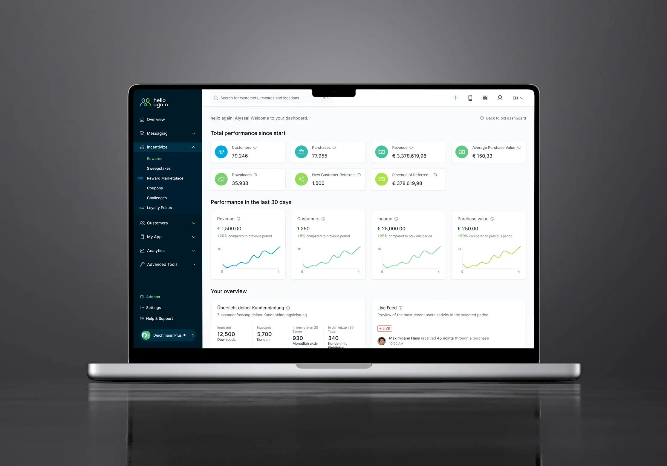
The dashboard alone has countless functionalities that make it a very complex system with many business rules; some of the main functionalities that can be performed in the dashboard are the following:
- View metrics and analytics
- Manage rewards
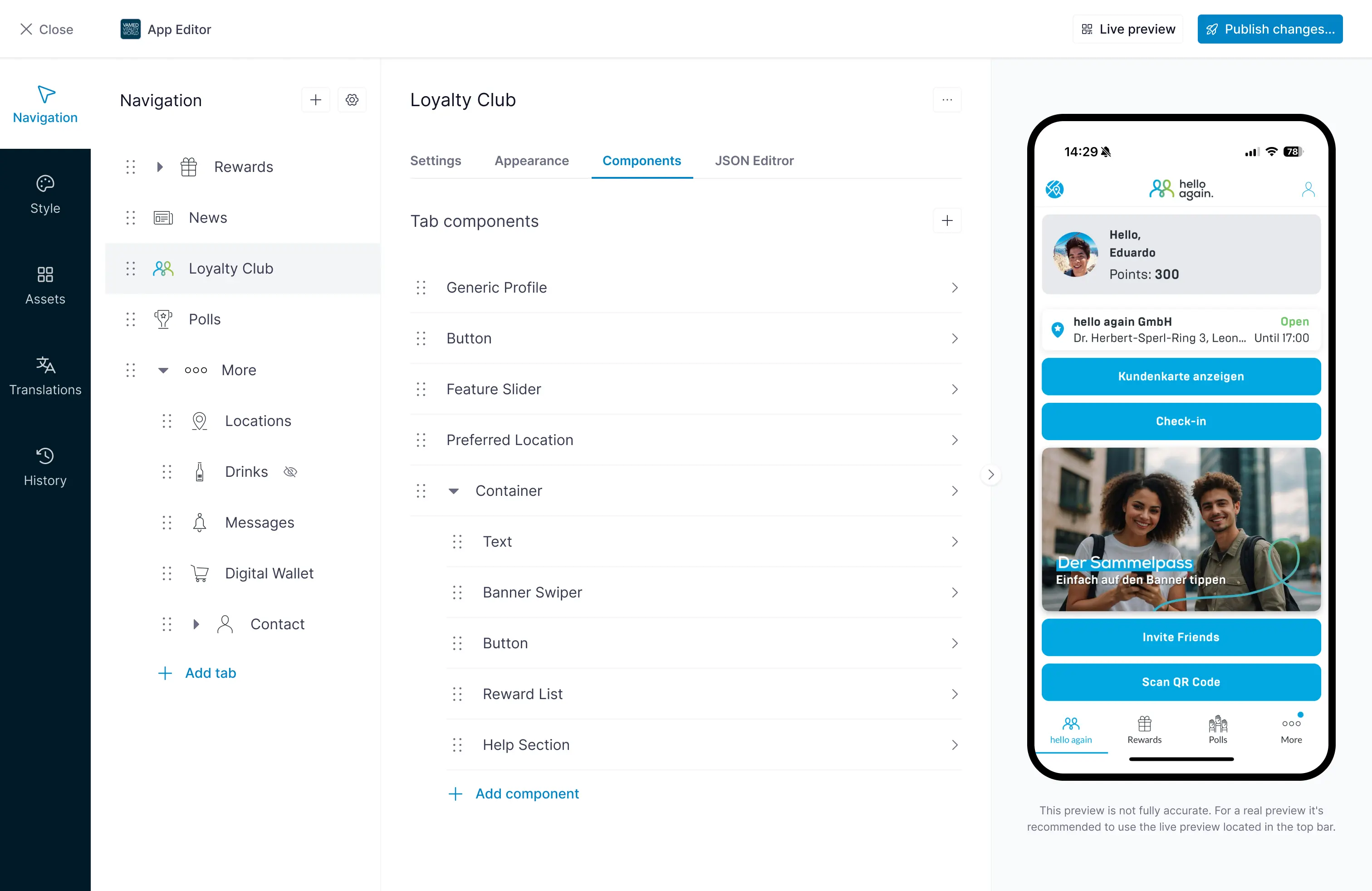
- Manage app design and content
- Send campaigns and messages through various channels such as email, SMS, push notifications, and WhatsApp messages
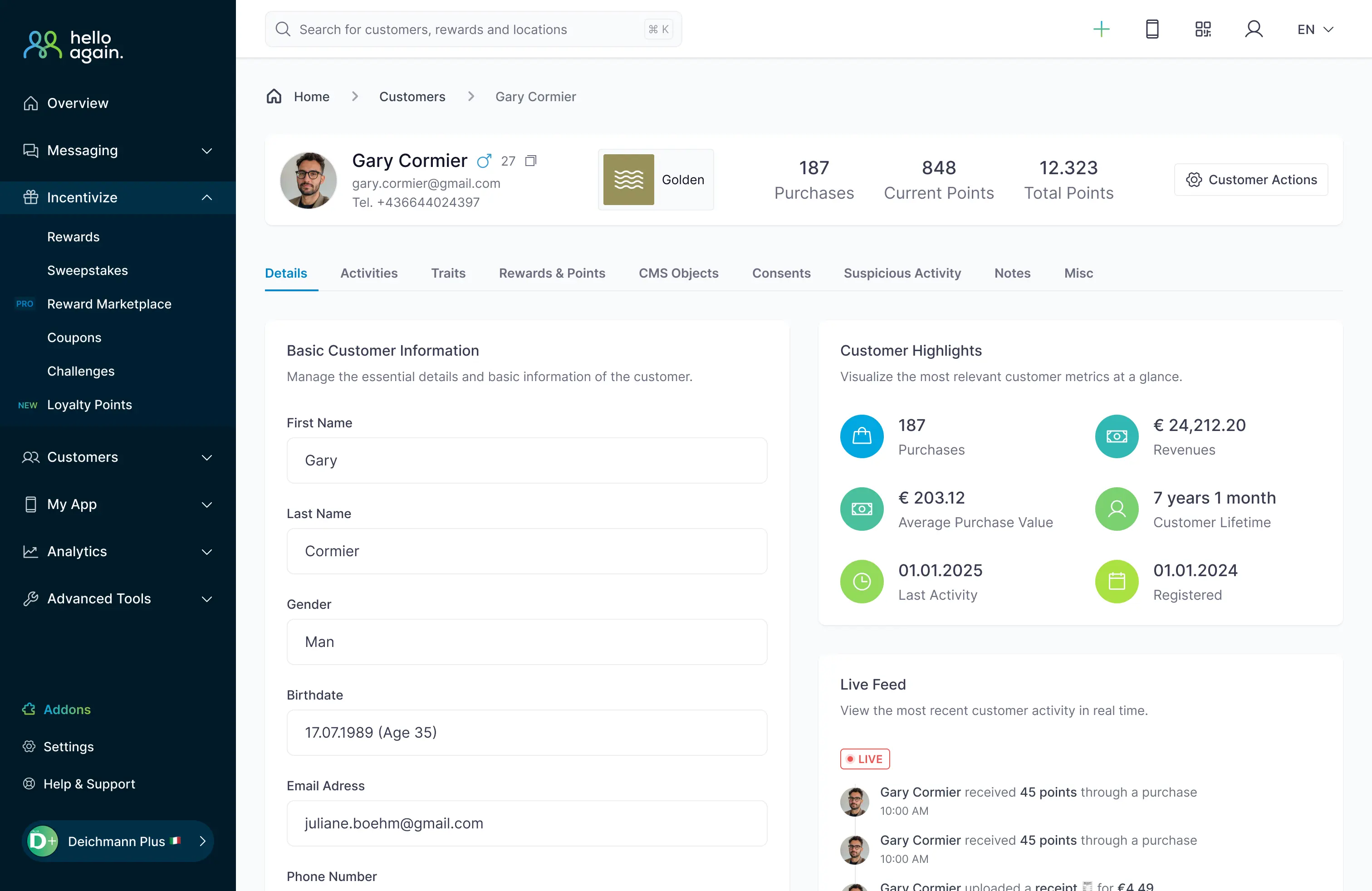
- Manage users
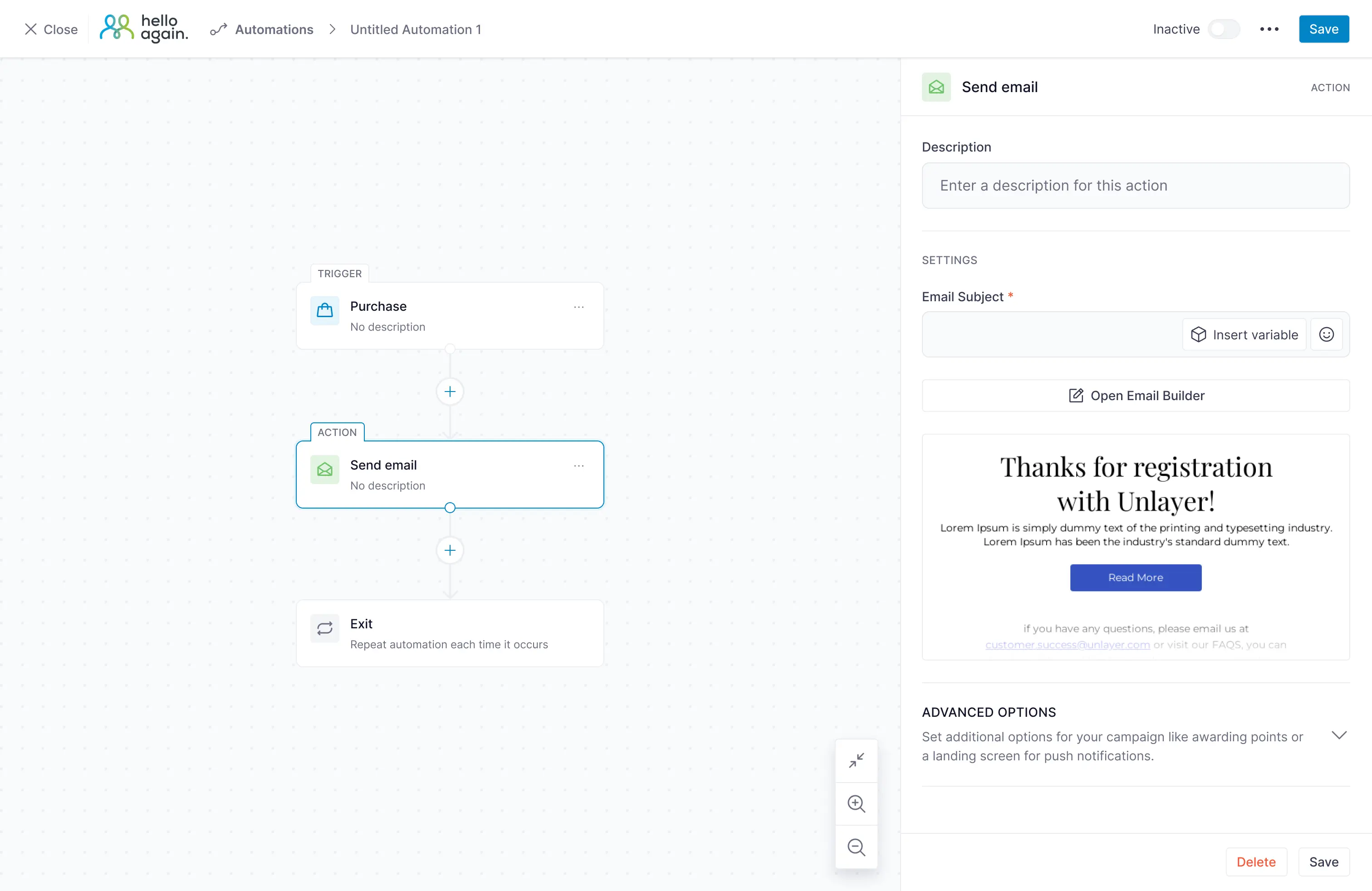
- Create and manage automations
- View and filter statistics, customize settings, manage legal matters, and much more
On the technical side, I can mention that the dashboard has dozens (perhaps hundreds) of pages and components, is developed with Vue as a framework, and its development and maintenance are mainly carried out by a team of frontend and backend developers.
My role in the project
When I joined the company, the dashboard was already developed and in use by customers, but it had a design that was quite outdated and that did not provide a good user experience. Therefore, my main task was to lead the redesign of the dashboard and to work closely with the development team to implement the new design.
The main goal of the redesign is to improve the user experience and make it easier for managers to use the dashboard and perform their tasks. To achieve this, I have been working on the following aspects:
- Redesigning the user interface of the dashboard to make it more modern and visually appealing
- Improving the information architecture and navigation of the dashboard to make it easier for managers to find the information and functionalities they need
- Designing new features and functionalities to improve the user experience and make it easier for managers to perform their tasks
- Working closely with the development team to ensure that the new design is implemented correctly and that the user experience is consistent across all pages and components of the dashboard
- Developing, implementing and maintaining most parts of the redesign, including new features and functionalities
Challenges and lessons learned along the way
A system that is already in use by millions of users
The main challenge of the project has been to redesign a system that is already in use by customers and users and that has a lot of functionalities and business rules. This has required a lot of work and coordination with the development team to ensure that the new design is implemented correctly and that the user experience is consistent across all pages and components of the dashboard. In addition, it has been necessary to design new features and functionalities that improve the user experience and make it easier for managers to perform their tasks.
Refactoring an old codebase
Another major challenge was that the dashboard was built using very old and outdated dependencies. Therefore, in order to implement the redesign using more modern tools and dependencies, it was necessary to do a huge refactoring of the entire project, which took about half a year. But it was worth it, as it laid the foundation for continuing to implement new functionalities using modern technologies and for ensuring that the dashboard’s performance remains efficient.
The importance of user feedback
Thanks to this project I learned that even if you are sure you have designed the right solution and internal tests may confirm certain hypotheses, the end users will always be the ones who truly decide whether the designed solution is correct or not, since they are the ones who use it daily. For this reason, it is essential to release a new design as soon as possible (even if it is not perfect) and to gather feedback from users to make the necessary adjustments and improvements to make sure you are on the right track.
User experience is a shared responsibility
Another great lesson was that in a dashboard of this type, good information architecture and optimal performance are crucial for users to find what they are looking for and perform their tasks quickly and efficiently; without these two elements, it doesn’t matter if the design is attractive or if you have a robust system design, users will end up frustrated and will not use the dashboard as they should. Remember, a good user experience is not responsability of the design team alone, it is a shared responsibility of the entire team, from designers to frontend and backend developers and even product owners.
Next steps
The redesign process is still ongoing and there are still many pages and components to redesign and implement, but the feedback from users has been positive so far and we know we are on the right track. In the coming months we will continue working on the redesign and implementing new features and functionalities to improve the user experience even more.
AI is also playing an important role in the project, we are currently working on implementing AI-powered features to help managers make better decisions and perform their tasks more efficiently, we are very excited about the potential of AI in this project and we will continue exploring new ways to leverage it to improve the user experience.
Thank you very much for reading this far, if you want to share your opinion with me or just say hello please feel free to drop me a mail, I’ll be happy to hear from you 😄.